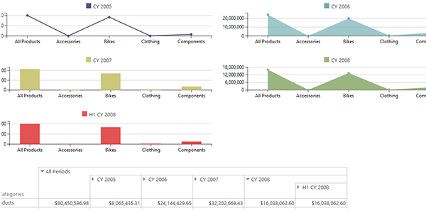
Ranet OLAP HTML Pivot Table provides options for visualizing data in the pivot table using pivot charts and heat maps. You can read about heat maps in one of our older blog posts. Now, let’s overview the functionality of Ranet pivot charts.
Setting up a pivot chart in Ranet OLAP
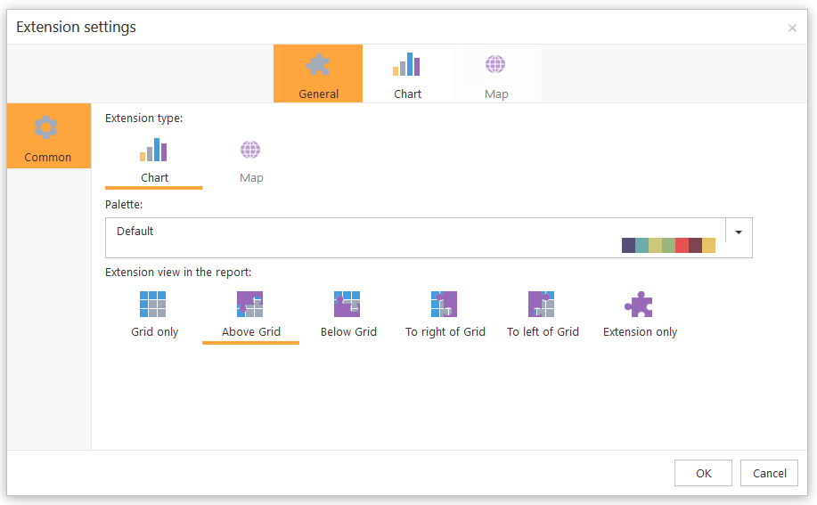
One of the features we introduced in version 5.7.150 is a new dialog window for customizing extensions for pivot table data visualization. Apart from the new design, the window has new options for setting up the pivot charts.
If you want to visualize the pivot table data on charts, you have to select the charts’ position and palette in the General tab.

In the Charts tab:
- choose if you want to use autogenerated or custom series
- choose if you want to show all the data in a single chart or a table of charts
- if you use the chart table, define its structure.
On the Common page, tick off the chart elements that you want to display (unless you use pie chart).
Using autogenerated series
If you choose to autogenerate series, you just need to select the diagram type you want to use for data visualization, and the chart will be generated automatically based on the data displayed in the pivot table.
If you don’t use the table of charts, all data will be visualized on one pivot chart. In case you do use the chart table, the data of each column will be shown on a separate chart.
Using custom series
In order to use custom series for chart generation, you have to select the column which data you want to see on the diagram and the diagram type. Only one column can be selected for one series.
Different series can be displayed on either one pivot chart or on several charts (in case you use the table of charts). Different diagram types can be shown on one chart.
Pivot pie charts
Unlike all other types of Ranet OLAP pivot charts, pie charts always visualize data on a table of charts, or multi-charts, regardless of the settings. Users can select which elements to display on the pie charts on the Chart elements page.
If you don’t need to display all pivot table data on the pie charts, you can create custom series on the Fine-tuning series page. In order to do so, you just need to select the columns which data you need to see on the chart. A separate series has to be created for each column.
As with the autogenerated series, each column’s data is displayed on a separate chart by default.
If you want to display the data for several columns on the same pivot pie chart, first filter the data in the pivot table, and then visualize it using auto-generated series.
Pivot table actions and sorting support in charts
Starting from version 5.7.150, all chart types support the basic pivot table actions, such as Drilldown, Drilldown by…, and Drilldown with parent. The action can be applied to either column or row of the chosen value. If the chart is a part of a table of charts, the action is automatically applied to all other charts in the table.
We have also added pivot table sorting support in the pivot charts. Whenever the data in the pivot table is sorted, the charts are updated accordingly.
We hope this article was helpful. Feel free to write to us in case you have any questions about using Ranet OLAP pivot charts and visualizing pivot table data.
