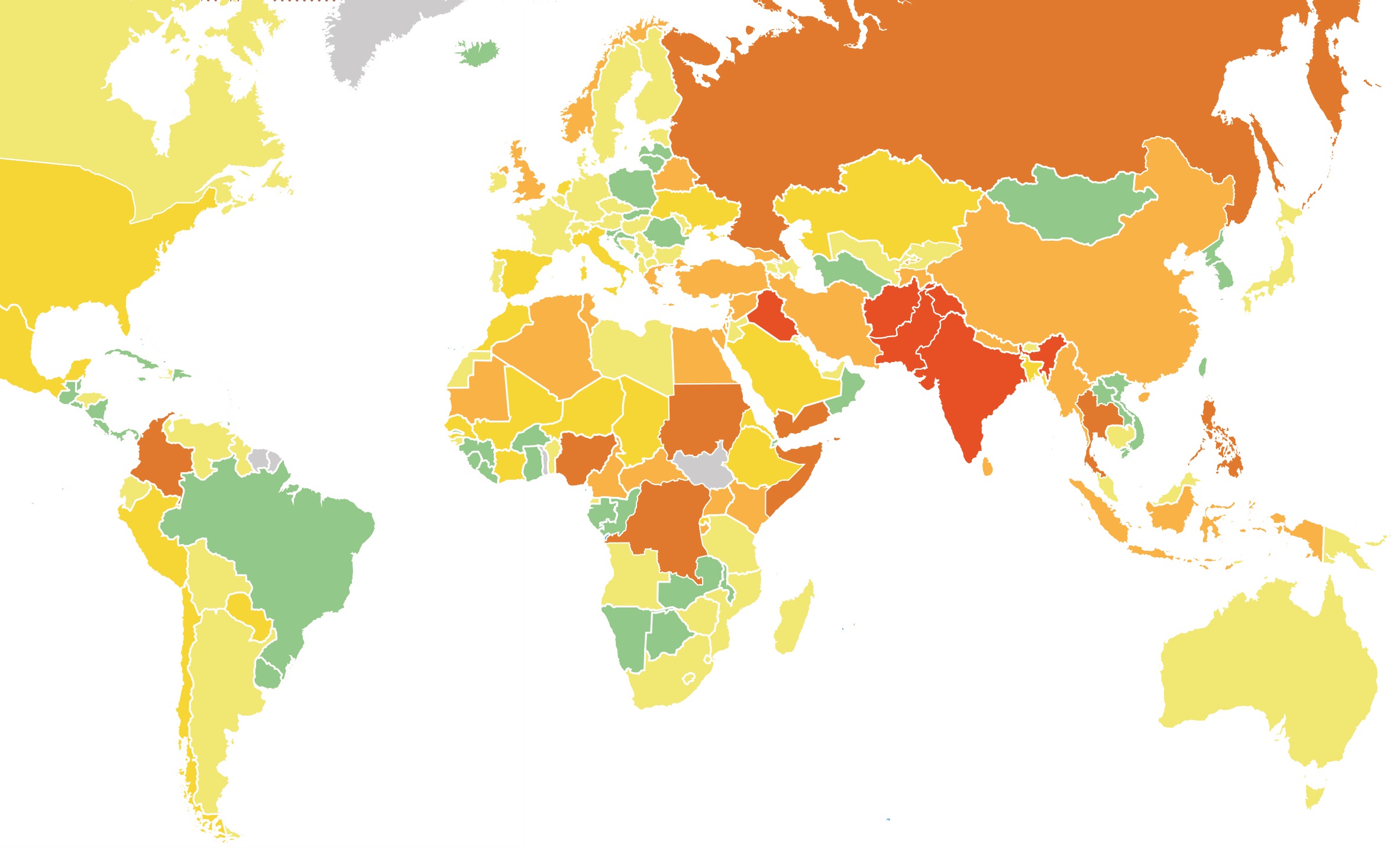
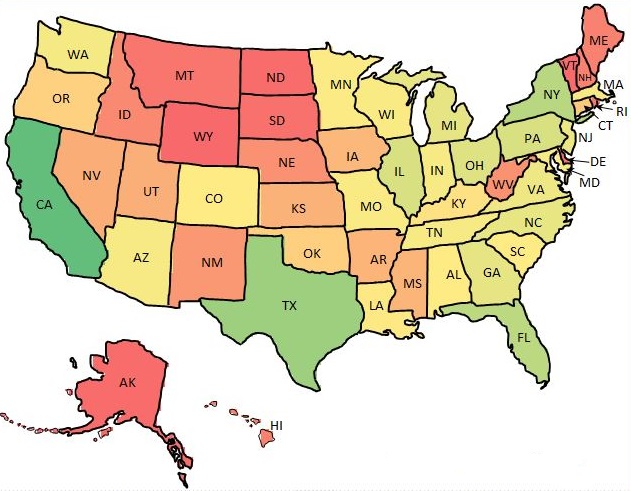
A couple of weeks ago, in our blogpost we already wrote about new data visualization features we’d added to the recent Ranet OLAP Pivot Table version. Now, we have started working on a new one for the HTML5 version of the table –the heat map. It will allow visualizing the data from the pivot table connected to a geographical location.
The heat map will represent a geographic map with different data values shown in different colors, thus providing the users with an immediate visual summary of the information they have in Ranet OLAP Pivot Table. It will give the users an insight into their data, thus allowing them to better analyze their business performance.

The heat map will have an opportunity to break down the data according to regions in certain countries. In case the users have enough information related to certain regions within countries in the pivot table, it will be shown on the map.
The users will see in which regions they do well, and in which – not so much, draw relevant conclusions, and make necessary adjustments to their business model or strategy, if needed.

We’ve only been working on the mock-up for the heat map for a couple of weeks, but we are sure it will be an incredibly useful business intelligence tool for our users. It will show the data in a way that will be much easier to grasp that when it is presented numerically in a spreadsheet or in a pivot table.
In case you have any questions about the future heat map data visualization feature, or have any suggestions, don’t hesitate to contact us.

