
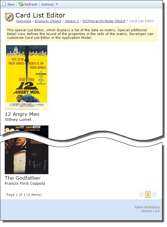
ASPx Card List Editor
Displays data in the form of a matrix, every object is shown as a card within a cell. The developer can customize the display of the field inside the card at its discretion. It is possible to customize the number of display options via the Model Editor. List Editor supports Web Editors Templates technology.
The following code snippet demonstrates CardListEditorObject business class for demonstration:
1 2 3 4 5 6 7 8 9 10 11 12 13 14 15 16 17 18 19 20 21 22 23 | public class CardListEditorObject : BaseObject { public CardListEditorObject(Session session) : base(session) { } public String Title { get { return GetPropertyValue("Title"); } set { SetPropertyValue("Title", value); } } public String Director { get { return GetPropertyValue("Director"); } set { SetPropertyValue("Director", value); } } [Size(SizeAttribute.Unlimited), ValueConverter(typeof(ImageValueConverter))] public Image Cover { get { return GetPropertyValue("Cover"); } set { SetPropertyValue("Cover", value); } } } |
You can view the code used in this lesson in the Xafari.XtraEditors.Module | Editors| CardListEditorObject.cs file of the Xafari XtraEditors demo installed with the product.
Template
Next, it is required to implement the Card List Editor template for displaying CardListEditorObject objects. You need to create Web User Control (.ascx file) which implements controls and layout to display CardListEditorObject class properties within the page.
Add a new Web User Control to the Web Application Project, name it Default, and replace the automatically generated Default.ascx file content with the following code:
1 2 3 4 5 | <%@ Control Language="C#" AutoEventWireup="true" CodeBehind="Default.ascx.cs" Inherits="Xafari.XtraEditors.Web.Templates.CardListEditorObject_ListView.Default" %> <%@ Register TagPrefix="dx" Namespace="DevExpress.ExpressApp.Web.Layout" Assembly="DevExpress.ExpressApp.Web.vXX.X, Version=XX.X.X.X, Culture=neutral, PublicKeyToken=b88d1754d700e49a" %> <%@ Register TagPrefix="asp" Namespace="DevExpress.Web" Assembly="DevExpress.Web.vXX.X, Version=XX.X.X.X, Culture=neutral, PublicKeyToken=b88d1754d700e49a" %> |
Note the DevExpress.ExpressApp.Web and DevExpress.Web assemblies versions. You should reference the appropriate assembly for your version of DevExpress.
Then, you need to specify that template is CardListEditorTemplateBase class descendant. You also need to set the relation between the template controls and the CardListEditorObject class properties. Open Default.ascx.cs file and modify it as follows:
1 2 3 4 5 6 7 8 9 10 11 12 13 14 15 16 17 18 19 20 | public partial class Default : CardListEditorTemplateBase { protected void Page_Load(object sender, EventArgs e) { TunePlaceholder(); TuneContent(); } private void TunePlaceholder() { panel.Attributes.Add("onclick", GetOnclickScript()); } private void TuneContent() { imageControl.Value = GetImageByteArray((GetCurrentObject()).Cover); lblTitle.Text = (GetCurrentObject()).Title; lblDirector.Text = (GetCurrentObject()).Director; } } |
Add CSS classes for the card. Add a new Style Sheet to Web Application Project, name it elements_style.css, and replace the automatically generated file content with the following code
1 2 3 4 5 6 7 8 9 10 11 12 13 14 15 16 17 | .rowPanel:before, .rowPanel:after { display: table; content: ""; } .rowPanel:after { clear: both; } .cardPanel { float:left; } .rowPanel { text-align:left; } |
rowPanel CSS class is suggested for the card rows, and cardPanel class is suggested for each individual card.
Register the elements_style.css style file. Open Default.aspx file and add the respective record to the section. Use the following code:
1 2 3 | ...
... |
You can view the code used in this lesson in Xafari.XtraEditors.Web project of the Xafari XtraEditors.sln demo solution installed with product. The used files are listed below:
- Templates|CardListEditorObject_ListView|Default.ascx
- Stylesheets|elements_style.css
Once the template is ready, invoke the Model Editor. Navigate to the CardListEditorObject_ListView node. Set the PropertyEditorType property to Xafari.Editors.Web.ASPxCardListEditor.
Now you can build and run your applications, and see what they look like after these changes.
Customization
ASPx Card List Editor exposes a number of additional properties for the flexible customization:
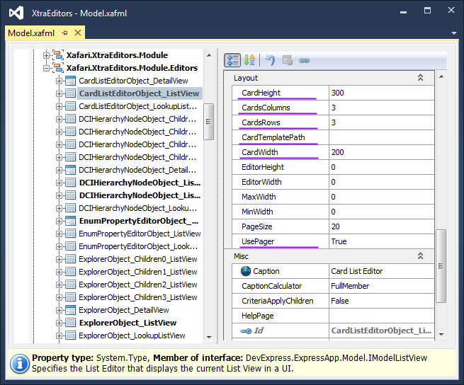
- CardHeight and CardWidth specify the card height and width. The default values are not preset. It is possible to use the saved card values in the template:
1 | CustomImageHeight = int.Parse(Model.CardHeight); |
- CardsColumns and CardsRows specify the number of cards in the row and column. The default value is 3.
- UsePager is a flag specifies whether to use the CardsRows value or not. If UsePager is false, then the CardsRows value is ignored, and all the elements of the list will be loaded. The default value is true.
- CardTemplatePath specifies the location of the template, this property is required when using Web Editors Templates.
