If the cell styles defined in the cube are not enough for efficient data visualization, Ranet end users can create custom pivot table cell styles. They significantly increase usability and simplify data analysis in the pivot table. The figures below show HTML and Silverlight pivot table with applied custom styles.
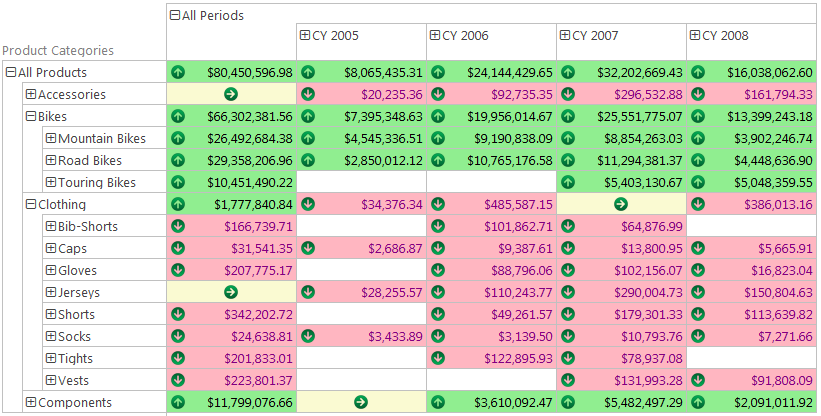
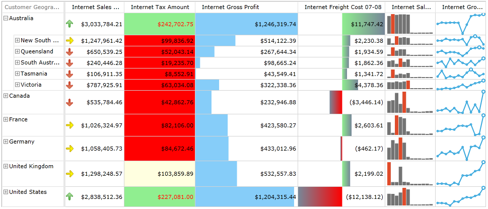
Custom cell styles in the pivot table are based on conditional formatting rules that allow highlighting cells or cell areas that correspond to certain conditions. Cell styles are set up via a special pivot table cell styles designer.
Cell Styles Designer
Ranet OLAP pivot table cell styles designer is available in HTML and WPF versions, with certain functionality differences. It uses conditional formatting to set up criteria for custom cell styles in the pivot table. Users can create several styles for the pivot table and several conditions for the same style. It is worth noticing that conditions can only be created for numeric values. If the data in the cells is not numeric, users cannot apply custom styles to these cells. Cell style designer allows highlighting pivot table cells or cell areas using:
- background and font colors
- images
- data bars(WPF, Silverlight)
- sparklines (WPF, Silverlight).
One style can contain different types of conditional formatting rules.
Custom Pivot Table Cell Styles
As mentioned above, there are several ways to create custom pivot table cell styles.
Background and Font Color
Users can set up different background and font color depending on the cell’s value. The color palette is fixed and cannot be changed by the user. In the WPF and Silverlight versions, users can also choose to apply color to the cell border. The figures show how to apply background and font colors in Silverlight and HTML pivot tables.
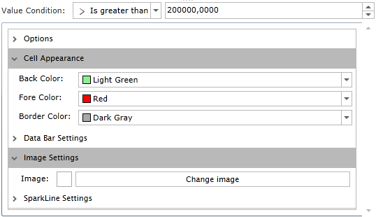
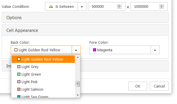
Images
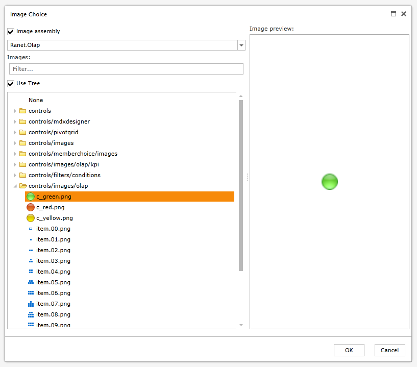
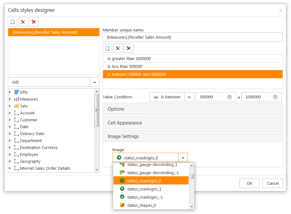
Users can choose to use images in the cells, together with (or instead of) values. The set of images in the tools are fixed and cannot be changed by the user. Using images in pivot table cell styles helps visualize data trends and changes over a period of time, indicate if values are above or below the critical level, etc.
Data Bars (WPF, Silverlight)
Data bars help the user to see the difference between cell values vividly - the bigger the value the longer the data bar.
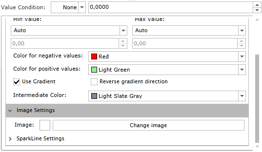
Users can customize the data bar to see maximum and minimum values, use several colors, gradients, etc. (see figure below). Settings applied to parent items are inherited by all their child.
Data bars are especially helpful when users need to analyze important indicators when working with large amounts of data.
Sparklines (WPF, Silverlight)
Sparklines are small charts that are shown inside a cell in the pivot table. They are useful in demonstrating the dynamics of data in time or during different seasons, identifying peak values, etc.
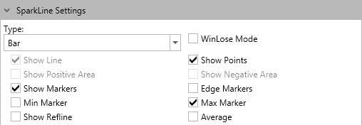
Pivot table cell style designer in Ranet OLAP allows users to customize the view of the sparkline and select its type (line, bar), whether to show points, markers, positive and negative areas, and the average value (see figures below).

Using sparklines and data bars is now available in WPF and Silverlight versions. We are planning to add this functionality to the HTML version in the future releases. In WPF and Silverlight versions, users can save custom pivot table cell styles and use them later.
We hope this article was useful and you have a better understanding how to use the pivot table cell styles designer and create custom cell styles in Ranet OLAP.
Feel free to contact us if you have any question or leave comments below.

