

Information and data is everywhere today. It is not a secret. The question is different: is it advantage or disadvantage for us? And, what is more important, how to filter all these endless data amounts and find the one we really need?
The answer is simpler than you think. Medical researchers have found that if the instruction contains only text, a person absorbs only 70% of the information from it. If you add pictures to the instruction, the person will already learn 95%. That’s right, visualization. And if we are talking about such complex data as business intelligence provides, data visualization is a savior. Follow the article and you’ll see yourself where and why to use data visualization.
What is data visualization?
Let’s start with a simple – data visualization definition. Data visualization is the presentation of data in the form that ensures the most effective work of the specialist in their study. It is widely used in scientific and statistical research (in particular, in forecasting, data mining, business analysis), in pedagogical design for training and testing, in news bulletins and analytical reviews. Data visualization is associated with information visualization, infographics, scientific data visualization, exploratory data analysis and statistical graphics.
For many years, companies have effectively used such simple data visualization tools as charts and histograms, and the further development of visual presentation technologies has made working with them more dynamic and processing information in real time. Developed business graphics include various dashboards and charts, which can be updated automatically according to specified settings.
There are several types of visualization:
- The usual visual representation of quantitative information in schematic form. This group includes all well-known pie and line charts, histograms and spectrograms, tables and various scatter plots.
- The data during visualization can be converted into a form that enhances the perception and analysis of this information. For example, a map and a polar graph, a time line and a graph with parallel axes, an Euler diagram.
- Conceptual visualization allows you to develop complex concepts, ideas and plans using conceptual maps, Gantt charts, graphs with minimal paths and other similar types of diagrams.
- Strategic visualization visualizes various data on all aspects of the organization’s work. These are all sorts of diagrams of performance, life cycle and graphs of the structures of organizations.
- Graphically organize the structural information using pyramids, trees and data cards will help metaphorical visualization, a vivid example of which is the map of the subway.
- Combined visualization allows you to combine several complex graphs into one scheme, as in the map with the weather forecast.

6 proofs you need to use it
So why does data visualization is so needed and spread? Let’s overview the reasons for that and point out benefits for you:
- Just think about these numbers and facts: a person perceives 90% of the information through eyes, 70% of sensory receptors are in the eyes, 17% higher performance of a person working with visual information. About half of the human brain neurons are involved in the processing of visual information. So if you want information being not only noticed but perceived, understood and learned you have to highlight it. And visualization tools will help you in it.
- Analysis of a large data set with a complex structure. Data amounts sizes and complexity are not matter here, as visualization tools help to analyze information quickly and present it in a simple manner. Besides, they provide the uniqueness and clarity of output data.
- Aesthetic appeal. Aesthetically attractive charts make the data presentation spectacular and memorable.
- Data visualization encourages the viewer to think about the essence, not the methodology. Helps avoid distorting what the data should say.
- Possibility of control and self-control. There is a separate concept of visual control using visualization tools that help to instantly determine the state of the controlled process. Visual inspection allows the responsible employee, having walked around the workplaces, looking, to assess what is happening in the process. Visual control is the fastest way to control, because there is no need to spend time on clarification, everything is clear.
- The absence or reduction of errors in the visualized information. One of the major advantages of visualization. When information is presented visually, the number of errors associated with its use is significantly reduced. Any inaccuracies in such information become immediately visible, they are quickly identified and eliminated. Inaccuracies associated with the wording and interpretation of the same data are also reduced, because information is in front of the eyes and such inaccuracies provoke its discussion. The proven fact that the transmitted information is perceived by another person with a high degree of distortion and is interpreted strictly individually. Visualization helps to smooth out problems of ambiguous understanding and problems associated with it.
Data visualization types and areas of use
We think it’s time to face the things we deal with. Let’s overview now what data visualization includes and touch upon all this magic variety of visualization tools. Whether good or bad data visualization examples surround us in our daily work, but let’s focus on the most efficient ones. Each of us had to work with at least one of those diagrams. And if not, you definitely heard their names.
Here are the most interesting types:
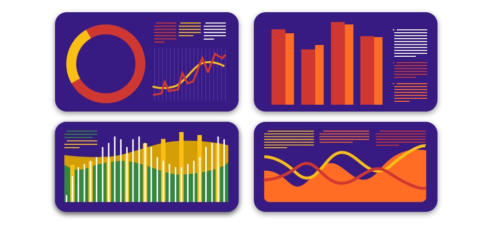
Bar Graph
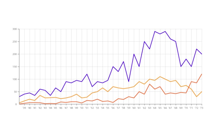
Line Chart
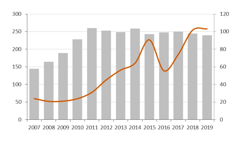
Multi-Axis Charts
Bar Histograms
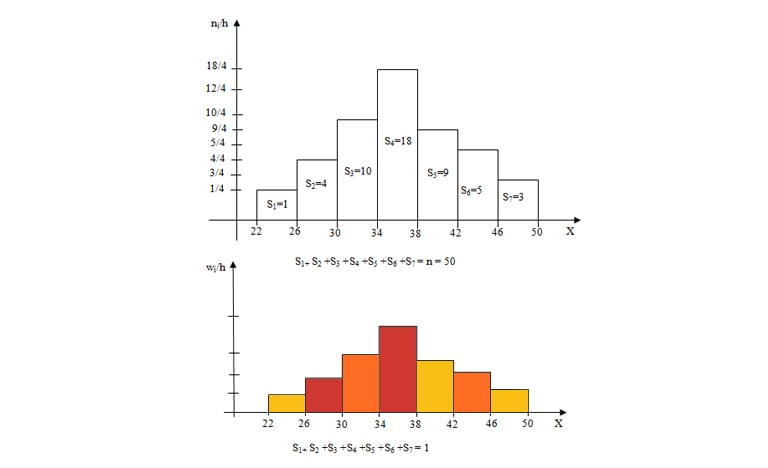
Like bar charts, histograms consist of columns. Therefore, these two types of graphs are often confused. Let's figure it out.
- There is a distance between columns.
- Used to compare categorical data.
- If you rearrange the columns, the logic will not be ruined. Venus and Earth are two categories that do not depend on each other.
- There is no distance between columns.
- Used to identify the dependence of qualitative data.
- If you rearrange the columns in the histogram of the observed temperatures, the logic will be ruined, since one value (temperature) is considered, but not different categories.
Spaghetti Charts
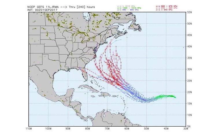
In addition to meteorology, these diagrams are suitable for visualizing relationships, which is especially useful in legal and judicial matters.
Pie Charts
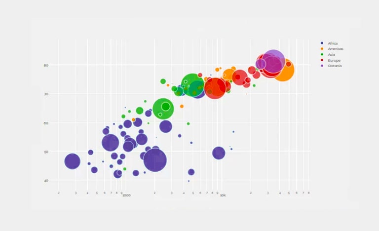
Bubble Charts
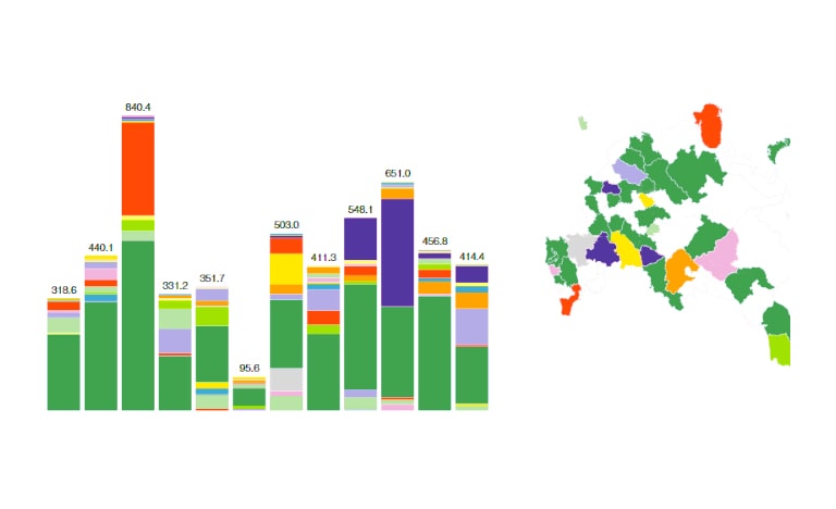
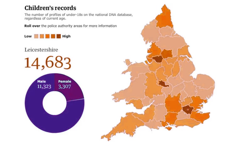
Map Charts
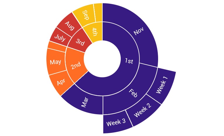
Sunbursts
7 data visualization tools for making your work easier
Thus, as familiarization stage has come to an end and you have accepted the necessity of visualization tool purchasing it’s time now to choose best data visualization tools for you. So catch the top visualization tools list and choose the right to visualize your business data.
Power BI

- Power BI Desktop is designed to develop data models and reports;
- Power BI Service is an online counterpart that specializes in monitoring and analyzing ready-made reports, so the possibilities of designing and working with data there are very limited.
Data visualization with Power BI includes 27 embedded tools: from map charts to normalized histogram. Transform data into stunning visualizations and share it with colleagues from any device. Explore and analyze visualized data — both locally and in the cloud — in a single view. All these becomes easy with Power BI.
Tableau
Benefits:
- Processing data of any format - from Excel to Oracle
- Does not require long-term implementation
- High speed of getting results
- Low cost
- Intuitive interface
- Creating any report in just a few steps
- Reduced data analysis time
Ranet OLAP

QlickView

Sisense

Sisense implements a complete BI cycle, from data preparation to web analysis and visualization, with great extensibility and control capabilities.
You’ll get:
- Direct data download from a variety of data sources and its : SQL Server, Oracle, MySQL, PostgreSQL, MongoDB, Hadoop
- Visual Database Design
- Easy creation of interactive dashboards and reports with customization of the design
- Sisense can be hosted either on its own server or in the cloud
- Open platform
IBM Cognos T1

This product allows you to quickly perform data analysis and modeling of business requirements of an organization, and then use the results of this analysis and modeling to confidently prepare budgets and forecasts that will allow you to achieve the best business results. Cognos TM1 is not just a software for budgeting and forecasting, but a complete solution for enterprise planning.
SAP Business Objects BI

Creates new opportunities for multidimensional analysis of the results of the enterprise, forecasting and planning future indicators.
SAP Business Objects includes a set of tools for customizing and creating a wide range of types of reports and applications, in the context of various indicators.
FAQ
Why to use data visualization?
Visual information is better perceived and allows you to quickly and effectively convey to the viewer your own thoughts and ideas. Physiologically, the perception of visual information is fundamental to people. Especially today, when we deal with huge data amounts and need to extract the most important as soon as possible.
Data visualization tools help to:
- read information quickly
- practically to process it on the fly
- make informed decisions backed up by data
How to do data visualization?
You understand the importance of data visual presentation, know what skills are needed for this and moreover, possess them. At the same time imagine that you have data for visualization, it remains only to figure out what types of graphs and charts fit. In dependence on your area and needs you can choose the required visualization way from the following:
- Bar Graph
- Line Chart
- Multi-Axis Charts
- Bar Histograms
- Spaghetti Charts
- Pie Charts
- Bubble Charts
- Map Charts
- Sunbursts
And of course, choose an appropriate data visualization tool which will include all the elements you need. For more info refer the previous part.
Why is visualization so important in business intelligence?
Business analysts as no one else understand the price of every minute. Thus, presenting data for analysis in a convenient, accessible form becomes a necessity. So BI data visualization technologies provides you with:
- Fast and easy data perception as a person perceives 90% of the information through eyes, 70% of sensory receptors are in the eyes, 17% higher performance of a person working with visual information.
- Analysis of a large data set with a complex structure.
- Aesthetic appeal.
- Data visualization encourages the viewer to think about the essence, not the methodology. Helps avoid distorting what the data should say.
- Possibility of control and self-control.
- The absence or reduction of errors in the visualized information.
What is the role of data visualization in big data ?
Another area from uses of data visualization is big data. The scientists continue to conduct research in the field of improving modern methods of presenting data in the form of images, diagrams or animations. It would seem that nothing new could be invented here, but in reality this is not so. Here are the best big data visualization tools:
| Tag Cloud | Each element in the tag cloud is assigned a specific weighting factor, which correlates with the size of the font. In the case of text analysis, the value of the weight coefficient is directly dependent on the frequency of use (citation) of a particular word or phrase. Allows the reader in a short time to get an idea of the key points of any large text or set of texts. |
| Clustergram | The visualization method used in cluster analysis. It shows how the individual elements of a set of data correlate with clusters as their numbers change. Choosing the optimal number of clusters is an important component of cluster analysis. |
| Historical flow | It helps to follow the evolution of a document that a large number of authors are working on at the same time. In particular, this is a typical situation for wiki services and the tadviser site as well. Time is plotted along the horizontal axis, and the contribution of each of the coauthors is plotted, The amount of text entered. Each unique author is assigned a specific color in the diagram. |
What is the best data visualization cloud service?
Talking about cloud service, we consider top tool here is Oracle Data Visualization. Providing a cloud option, the Oracle Data Visualization solution is powerful enough to perform complex calculations and is convenient to use:
- Automatically visualize data as attributes, graphs and charts move.
- Change layouts to submit new data
- Answer questions quickly with online search and easy navigation.
- Make sure that all your employees can get the most out of the data.
Final words
Data visualization is a powerful tool for conveying thoughts and ideas to the end user, an assistant for perception and analysis of data. But like all technologies, it must be applied in its time and place, and most importantly, using the right tools. Otherwise, information may be perceived slowly, or even incorrectly. Solutions like Ranet OLAP will help you avoid these mistakes.
With skillful application, data visualization allows you to make the material impressive, not boring and memorable.
