
Data visualization is one of the most interesting aspects of OLAP in BI and an important part of data analysis and reporting processes in any company. After hours dedicated to retrieving, slicing/dicing and analyzing your data, it needs to be properly presented in the correct form to the correct audience.
Visualizing your business data is like the proverbial icing on the cake. You have conducted a good data analysis, and the right data visualization makes its results even more effective. Conversely, if you fail to deliver the data dully to the people it was aimed at all your data crunching efforts may go down the drain.
Data visualization options abound in modern ad hoc analysis and reporting tools and offer wide opportunities to make your data stand out. However, it simultaneously creates a problem of choosing the right option for your particular case.
Let’s review some of the most common ways to visualize your data and how and when to use them.
Bar Charts
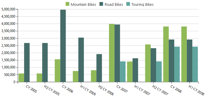
Bar charts are best used to compare data about different items for the same period of time (compare data across categories) and to show how the data changes chronologically. Use this type of data visualization when you need to analyze the growth/decline/fluctuations in sales over time or compare sales of different items within a certain period.
Stacked Bar Charts
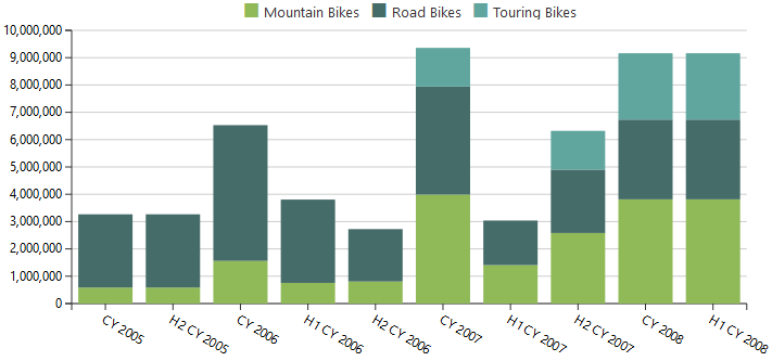
Rather than showing you the data as a whole, stacked bar charts let you see the relation between the data and compare various data slices.
You have to be careful not to use too many variables as too many bars will many the chart look cluttered and hard to comprehend.
Line Charts
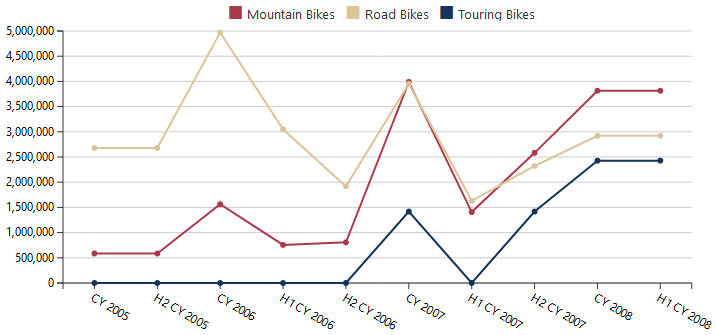
A line chart should be your choice if you need to visualize data trends or show increase/decrease in data over a period of time. As compared to bar charts, they are especially helpful in case the difference between data about different items is not that striking or there are no big changes in data during a time interval. It also works very well to display seasonal changes of the data. However, just like with bar charts, you have to be careful not to make your chart too complicated.
Area and Stacked Area Charts
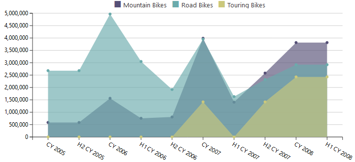
Area charts are similar to line charts in demonstrating data trends over a time period. They are essentially line charts with the colored area below the line. Using color can help to better demonstrate differences between parts of data for a particular period. However, area charts should be used carefully as it can sometimes be confusing when different areas overlap.
This issue can be avoided by using a stacked area chart.
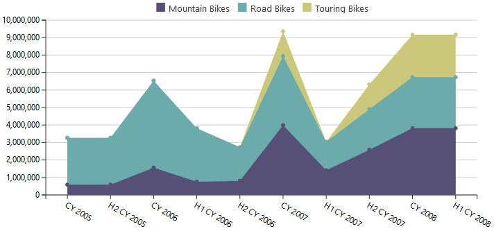
The concept is similar to a stacked bar chart, where stacked areas form a whole dataset. The height of the areas reflects the relation of the part to the whole. Such charts are good to use when you want to see changes in two or more related groups that make up one whole category.
Pie Charts
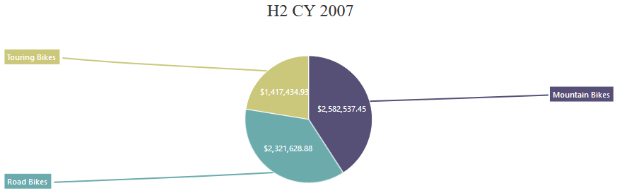
Pie charts are best used for displaying proportional data and percentages. They show a proportional composition of a particular dataset. Unlike line charts, for example, pie charts visualize data for a static time period, without demonstrating data changes or trends.
It is better to avoid using pie charts in you have more than three variables. In such case, a stacked bar chart will be a lot more effective.
Pivot Tables
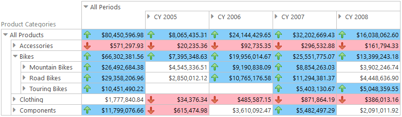
Pivot tables are not often viewed as means of data visualization, but in some cases, they can be very helpful, particularly, if you need to display precise numbers, like financial results for a certain period of time. Using different styles for cells helps to give the audience ideas about data changes and trends.
What to consider when using data visualization
There are a couple of questions you need to ask yourself before choosing the way to visualize your business data.
Who is your audience? Are they well-versed in the subject? Will they understand numeric data or do you need to see data relation and trends?
What message are you trying to convey? Is time the factor: are you trying to show the data trends over time or is it the final result that matters?
How will the data be used? Will it be used for KPIs assessment or will it influence the company’s manufacturing or marketing?
Answering such questions will help you choose the right data visualization type for your report and deliver the message effectively to the audience.
You can try working with various data visualization options using Ranet OLAP online demo.
Continuing working with pivot tables in Ranet OLAP, we invite you to read our blogpost about building and integration of ASP.NET pivot table.
